![]()

A lightweight Python package for calculating and visualizing cohort retention and other cohort-based metrics. With just a few simple commands, you can analyze user behavior and trends over time by grouping users into cohorts based on their acquisition period and tracking their activity or other values (e.g., revenue, transaction count) in subsequent periods.
- Cohort Analysis Made Easy: Quickly calculate user retention, revenue trends, and other cohort-based metrics.
- Insightful Visualizations: Create heatmaps and retention curves to uncover patterns in your data, enabling deeper insights into user behavior and trends.
- GitHub: https://github.com/krinya/repeatradar
- PyPI: https://pypi.org/project/repeatradar/
Documentation: https://krinya.github.io/repeatradar/
Medium Article with examples: https://krinya.medium.com/beyond-transactions-unlock-customer-purchasing-patterns-with-repeatradar-package-in-python-d77a11939e19 - Example notebooks:
To install RepeatRadar, simply use pip:
pip install repeatradarHere's how you can quickly calculate user cohort data from your dataset:
from repeatradar import generate_cohort_data

# Load your data (example dataset available in examples/data/)
ecommerce_data = pd.read_pickle("https://github.com/krinya/repeatradar/raw/refs/heads/main/examples/data/ecommerce_data_1.pkl")

# Basic Monthly User Cohort Analysis
# This creates a cohort table showing unique user counts for each period

basic_cohorts = generate_cohort_data(
    data=ecommerce_data,
    date_column='InvoiceDateTime',
    user_column='CustomerID',
    cohort_period='M',       # Monthly cohorts (users grouped by acquisition month)
    period_duration=30       # Track in 30-day periods
)

# This shows how many unique users return in each 30-day period
basic_cohorts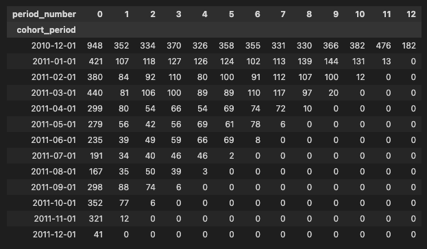
You can visualize the cohort data using heatmaps to better understand user retention trends:
from repeatradar import plot_cohort_heatmap

# Create an interactive heatmap
heatmap_fig = plot_cohort_heatmap(
    cohort_data=basic_cohorts,  # The cohort data generated above
    title="📊 User Retention",
    color_scale="viridis",
    show_values=True,
    show_colorscale=False,
    width=900,
    height=600
)
heatmap_fig.show()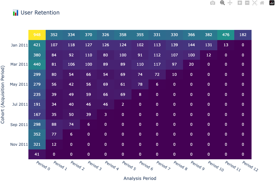
💡 Tip: For detailed examples and advanced usage, check out the Cohort Calculation Examples and Visualization Examples notebooks.
This project is licensed under the MIT License. See the LICENSE file for details.